library(tidyverse)

cleaner_analysis <- analysis %>%
  mutate(fname = str_extract(Name, pattern = "([A-Za-z]+\\s+)") %>%
           str_trim("both"),
         lname = str_extract(Name, pattern = "(\\s+[A-Za-z]+)")  %>%
           str_trim("both"),
         staff_fname =str_extract(Staffer, pattern = "([A-Za-z]+\\s+)") %>%
           str_trim("both"),
         staff_lname = str_extract(Staffer, pattern = "(\\s+[A-Za-z]+)") %>%
           str_trim("both"),
         `Level of Influence` = as.factor(`Level of Influence`),
         `People to Know` = `Persons to know`) %>%
  select(fname, lname, State, District, staff_fname,
         staff_lname, `Level of Influence`, `People to Know`)

cleaner_analysis[which(cleaner_analysis$lname == "Jacbos"), ]$lname <- "Jacobs"Going Beyond Spreadsheets with R
news
how to
code
analysis
but why
R
data viz
advanced
hype
Imagine the following spreadsheet: The names of elected officials, their districts, the names of their staff, and a list of people that these electeds deem “good to know.” A power analysis like this is fairly common, and the way to do it varies wildly: as a word document, sticky notes on a wall, a Google doc or Sheet, or an Excel Spreadsheet. Each one of those methods have their own way of managing, updating, grouping and visualizing the data. Yet each one has its a number of limitations: Unless you share photos of the sticky notes, you can’t really share the data outside of the office. Word documents can be emailed, but their graphics leave a lot to be desired – as do their grouping techniques. Spreadsheets can do a lot for you in terms of grouping and sorting the data so you can see staff in alphabetical order, but the minute you want to see a map of where the electeds live, you’re back to square one.
To get the most of this power analysis, a number of tools – free, “freemium”, and paid – are available to help capture, store, shape (i.e. sort or break into smaller units of data), and share the insights. The key word here is tools. Organizations will probably use spreadsheets, emails, note cards, exports from Van or some other content tool, and word docs to analyze and share the data. The tool Kylah and I are using is R, as built for statistical analysis, data visualization and sharing findings. R also works quite well with a most other tools in the data space. There are, of course, other tools that fill this role. Overtime, we are planning on learning them – but for now, we’re focusing on R and it’s ecosystem.
Fake data, real solutions
First and foremost, I made up most of the names in our dummy data. A handful of names are from our organizing team – The Small and Mighty Southwest Side Team – but the names of the electeds and their staff is a total fabrication.
This post is also aspirational: This is the work Kylah and I want folks to do with R. It showcases where we are as developers and where we want to go as organizers. Most of our posts will be more along the lines of “Here is why and how you want to do X.” This is just all of that in one early post to get folks to think of how to make their data work for them.
Spreadsheets are a great tool…
The following is a screenshot of a fake power analysis. It tracks the names of electeds and their connections with other people.
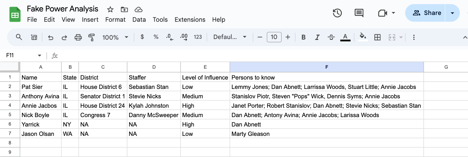
At a glance, we can see that in the 6 entries, we have a few connections:
- This org has a “low” level of connection to State Rep Sier.
- A “Medium” level of connection to State Senator Avina.
- A “High” level of connection to Representative Annie Jacobs.
- A “Medium” level of connection to Congressman Nick.
- Illinois State Rep “Annie Jacobs” is listed as “a person to know” in each other person’s fields.
- There’s a connection between two people who have no connection to anyone else on the sheet.
If we kept the analysis to Google Sheets, there are a number functions in Sheets (and Excel) we could use to help clarify the insights contained in this sheet:
- Using forms to validate data entries.
- This is an technique to add at the front of the analysis, but it can be useful.
- Color coding to help a reader identify connections and influence easily.
- Using functions to separate columns and combine columns
- Fixing typos with editing and a judicious use of functions.
These methods will work regardless of the data set’s size; however, there are some drawbacks. If this org’s power analysis was centered on the connections between city, state, and federal legislators, other organizers and community groups, this list would have hundreds of dense observations. Finding insights when the data is packed into a dense spreadsheet is difficult to enter and even more difficult to share.
Typos will be a very real issue to address, regardless of how the data is entered. All the entries, whether they are observations (rows), variables (columns), or entirely new worksheets, will have to be organized, cleaned, and transformed. Many of the spreadsheets functions will work with new rows, but adding new columns may break the function. New worksheets will require all new functions. And if a spreadsheet has hundreds, or thousands, of color coded rows, it may be better to generate a data visualization – and some of the best tools for creating those visuals are completely separate tools.
My tool of choice is the R ecosystem. This doesn’t mean I don’t use spreadsheets – on the contrary, I’ve found that I’ve been able to design and use spreadsheets in a more effective manner because spreadsheets have a specific role in my work flow. In other words, instead of using spreadsheets for all my analysis tasks, I use spreadsheets for collecting and organizing the data. I use R to clean, transform, visualize, and share my results.
…But sometimes, you need to upgrade your tools
If we return to the fake power analysis example, in a few lines of code we can transform the Google sheet into a color coded, sort-able by last name table. The benefit of these lines of code? They can be used with new spreadsheet, which is far more efficent than re-creating spreadsheet functions.
The first step is splitting the staffer and legislator’s name into first and last names. Then we’ll color code the new table by level of influence and finally, make it sort-able.
Mutate is a method of the dplyr package to create new columns in a dataframe. str_extract is a method that looks for a pattern in a string. The "([A-Za-z]+\\s+)") pattern is RegEx pattern – a powerful way of working with text. A tweak to this pattern can identify names with spaces, hyphens, or other punctuation that would be more difficult to do in a spreadsheet. It is also a tool I constantly have to use Google or ChatGPT to get anywhere near correct. In fact, the str_trim("both") function is an example of cleaning up my regex mistake – the pattern includes blank spaces, when it really should only include the characters of each person’s name. Select is a way to select and order columns, and it is also part of the dplyr package.
Also, when editing, I discovered a typo with Rep Jacobs. I misspelled her name. The cleaner_analysis[cleaner_analysis$lname == "Jacbos", ]$lname <- "Jacobs" is a find/replace function that finds the misspelling and fixes it.
Printing a data frame by calling print() is not the same thing as making a good table. For instance this:
cleaner_analysis# A tibble: 6 × 8
fname lname State District staff_fname staff_lname `Level of Influence`
<chr> <chr> <chr> <chr> <chr> <chr> <fct>
1 Pat Sier IL House Distr… Sebastian Stan Low
2 Anthony Avina IL Senator Dis… Stevie Nicks Medium
3 Annie Jacobs IL House Distr… Kylah Johnston High
4 Nick Boyle IL Congress 7 Danny McSweeper Medium
5 Steve Yarson NY NA <NA> <NA> High
6 Jason Olsan WA NA <NA> <NA> Low
# ℹ 1 more variable: `People to Know` <chr>Works for exploratory data analysis, but not for sharing with others. To do that, a better option is the gt() package.
library(gt)
library(tidyverse)

today_yyyy <- lubridate::today()

cleaner_analysis %>%
  gt() %>%
  tab_header(title = md("**Fake Power Analysis**"),
             subtitle = paste0("R 4 Revolution", " ",
                               format(today_yyyy, "%m/%d/%y"))) %>%
  data_color(
    column = `Level of Influence`,
    method = "factor",
    palette = "viridis") %>%
  cols_width(fname ~ px(105),
             lname ~ px(105)) %>%
  cols_label(
    fname = "Legislator<br>First Name",
    lname = "Legislator<br>Last Name",
    staff_fname = "First Name",
    staff_lname = "Last Name",
    .fn = md
  ) %>%
  cols_hide(columns = `People to Know`) %>%
  opt_interactive()
Fake Power Analysis
R 4 Revolution 04/16/24
This table has a title, sort-able headers, and a color coded column for easy identification. One column was removed – People to Know – as this requires additional cleaning to make sense.
Using Scripts
R scripts speed up analysis. For example, if another elected was added to the power analysis Google sheet, it would be formatted, cleaned, and color-coded in with the same code. If the data is formatted the same way, no work needs to be done on this code. If the data is messy - and it probably will be messy - a few changes to the code can still bring it into line. For instance, more regex to clean up text consistently.
These factors alone may not help spreadsheet-focused-friends to learn a new tool, but the next three items might: Complex cleaning, mapping, and complex data viz.
Complex Cleaning
The R table removed the People to Know column as it needs more cleaning. Here’s why:
cleaner_analysis %>%
  mutate(Name = paste(fname, lname, sep = " ")) %>%
  select(Name, `People to Know`) %>%
  gt() %>%
  tab_style(
    style = list(
      cell_fill(color = "lightblue")
    ),
    locations = cells_body(
      columns = `People to Know`,
      rows = str_detect(`People to Know`, ",")
))| Name | People to Know |
|---|---|
| Pat Sier | Lemmy Jones; Dan Abnett; Larrissa Woods, Stuart Little; Annie Jacobs |
| Anthony Avina | Stanislov Piotr, Steven "Pops" Wick, Dennis Syms; Annie Jacobs |
| Annie Jacobs | Janet Porter; Robert Stanislov; Dan Abnett; Stevie Nicks; Sebastian Stan |
| Nick Boyle | Dan Abnett; Antony Avina; Annie Jacobs; Larissa Woods, Steve Yarson |
| Steve Yarson | Dan Abnett |
| Jason Olsan | Marty Gleason |
If we look at the People to Know column, we can see that in the entire row is made up of multiple entries. Looking at Pat and Anthony’s rows, we can see that there is a “,” breaking up entres instead of a “;”. This does not appear to matter with such a small data set, but how many observations would it take for a person’s eyes to glaze over and miss this detail? A computer will recognize the different characters but it does not have the context to know if this is a typo or intentional. In order for there to be additional analysis, the entries would need to be separated into different entries. Doing this will require using software to recognize both kinds of separators, “,”, “;” or anything in between. Regardless of the need for more human or software based analysis, cleaning this kind of data is essential.
More Cleaning for More Analysis
To clean a column like People to Know, the tidyverse has a fantastic package called stringr, which lets a user quickly and easily leverage regex patterns.1 Best practices – specifically tidy data – states that People to Know should be limited to one entry per row. R has a way to do that called separate_longer_delim – note in the code example the delim = stringr::regex("[;,]")). This allows the separate_longer_delim to use regex to find all of the special characters that were used to separate a column.
*Please note that I’m turning this into a gt table so this data set is easier to read:*
#fix anthony's name in People to know
cleaner_analysis %>%
  separate_longer_delim(`People to Know`,
                       delim = stringr::regex("[;,]")) %>%
  mutate(`People to Know` = stringr::str_trim(`People to Know`, "both")) %>%

  gt() %>%
  tab_header(title = md("**Fake Power Analysis**"),
             subtitle = paste0("R 4 Revolution", " ",
                               format(today_yyyy, "%m/%d/%y"))) %>%
  cols_width(fname ~ px(105),
             lname ~ px(105)) %>%
  cols_label(
    fname = "Legislator<br>First Name",
    lname = "Legislator<br>Last Name",
    staff_fname = "First Name",
    staff_lname = "Last Name",
    .fn = md
  ) %>%
  opt_stylize(style = 6,
              color = "cyan")%>%
  opt_interactive(use_pagination = FALSE)
Fake Power Analysis
R 4 Revolution 04/16/24
This format allows for more analysis, as it is now tidy. While this format is all that friendly for people to read, it is a step that allows for the creation of great data visualizations:
library(ggraph)
suppressMessages(library("igraph")) #this turns off all the messages generated by the packae on load.
library("networkD3")

cleaner_analysis %>%
  separate_longer_delim(`People to Know`,
                        delim = stringr::regex("[;,]")) %>%
  mutate(`People to Know` = stringr::str_trim(`People to Know`, "both"),
         name = stringr::str_trim(paste(fname, lname, " "), "both")) %>%
  select(-1:-7) %>%
  simpleNetwork(nodeColour = "#00008B",
                opacity = 1,
                linkColour = "black",
                fontSize = 13,
                height="100px", width="100px",
                zoom = TRUE)
Network Analysis of Fake Power Players
This code block shows how powerful R can be - The data frame was cleaned and transformed into an interactive network analysis. At a glance, we can see who is connected to whom. Clearly, Rep Jacobs is someone this grassroots org should connect with.
Maps: Another Step Beyond Spreadsheets
Another analysis that goes beyond a spreadsheet is the ability to create a map. These types of data visualizations can generate incredibly grounding insights and help an organization decide where to build power.
cleaner_analysis %>%
  mutate(name = paste(fname, lname, sep = " ")) %>%
  select(name, District) %>%
  gt() %>%
  cols_label(
name = "Legisilator Name")| Legisilator Name | District |
|---|---|
| Pat Sier | House District 6 |
| Anthony Avina | Senator District 1 |
| Annie Jacobs | House District 24 |
| Nick Boyle | Congress 7 |
| Steve Yarson | NA |
| Jason Olsan | NA |
Here we see the legislators and their districts in the great state of Illinois. A quick Google search of the district will return a lot of information, including the boundaries of their districts. Many organizers will know what precinct, ward, district, and congressional map overlaps with what but there is a difference in knowing a geographic boundary and seeing one. Instead of Googling for the boundaries of a particular political geography, if an organizer looks for a shapefile then we can unlock even more insights.2
Shapefiles: Mapping Boundaries
A shapefile is a “simple, nontopological3 format for storing the geometric location and attribute information of geographic features.” In other words, a shape file contains the geometric features that make up particular geographic boundaries. These documents can be used by R to draw maps. For our demonstration, we are looking for the following Illinois districts for our interactive map:
- House District 6
- Senate District 1
- House District 24
- Congressional 7
Filtering
Our example has two (fake) state reps. Before we can map anything, we have to find those two districts in the shapefile itself. Fortunately, that’s pretty easy. The sf is a wonderful package for working with shapefiles and GIS functions. This package allows a user to filter, combine, and manipulate GIS data using the same syntax as the tidyverse. In the following code block, we’ll examine the structure of the state-rep data frame and then filter out all but the two reps we are interested in:
library(tidyverse)
library(sf)
library(leaflet)
library(here)

state_rep <- st_read(here("posts", "post-with-code","shapefiles", "state_rep","State_Representative_District%2C_effective_Jan._11%2C_2023.shp"))
Reading layer `State_Representative_District%2C_effective_Jan._11%2C_2023' from data source `/Users/marty/Local Dev Projects/R/r_4_revolution/posts/post-with-code/shapefiles/state_rep/State_Representative_District%2C_effective_Jan._11%2C_2023.shp'
using driver `ESRI Shapefile'
Simple feature collection with 62 features and 10 fields
Geometry type: MULTIPOLYGON
Dimension: XY
Bounding box: xmin: 1003172 ymin: 1749885 xmax: 1205615 ymax: 1998855
Projected CRS: NAD83 / Illinois East (ftUS)glimpse(state_rep)Rows: 62
Columns: 11
$ OBJECTID <int> 1, 2, 3, 4, 5, 6, 7, 8, 9, 10, 11, 12, 13, 14, 15, 16, 17, …
$ DISTRICT_T <chr> "1", "2", "3", "4", "5", "6", "7", "8", "9", "10", "11", "1…
$ DISTRICT_I <int> 1, 2, 3, 4, 5, 6, 7, 8, 9, 10, 11, 12, 13, 14, 15, 16, 17, …
$ created_us <chr> NA, NA, NA, NA, NA, NA, NA, NA, NA, NA, NA, NA, NA, NA, NA,…
$ created_da <chr> NA, NA, NA, NA, NA, NA, NA, NA, NA, NA, NA, NA, NA, NA, NA,…
$ last_edite <chr> NA, NA, NA, NA, NA, NA, NA, NA, NA, NA, NA, NA, NA, NA, NA,…
$ last_edi_1 <chr> NA, NA, NA, NA, NA, NA, NA, NA, NA, NA, NA, NA, NA, NA, NA,…
$ RELATE_KEY <chr> "StateRep_1", "StateRep_2", "StateRep_3", "StateRep_4", "St…
$ ShapeSTAre <dbl> 316655517, 378453173, 152850651, 158093367, 190384838, 2529…
$ ShapeSTLen <dbl> 159876.21, 124541.27, 117846.97, 99441.99, 142005.30, 14958…
$ geometry <MULTIPOLYGON [US_survey_foot]> MULTIPOLYGON (((1164478 187..., M…rep_districts <- state_rep %>%
filter(DISTRICT_T == 6 | DISTRICT_T == 24)
rep_districtsSimple feature collection with 2 features and 10 fields
Geometry type: MULTIPOLYGON
Dimension: XY
Bounding box: xmin: 1157002 ymin: 1858804 xmax: 1180622 ymax: 1902959
Projected CRS: NAD83 / Illinois East (ftUS)
OBJECTID DISTRICT_T DISTRICT_I created_us created_da last_edite last_edi_1
1 6 6 6 <NA> <NA> <NA> <NA>
2 24 24 24 <NA> <NA> <NA> <NA>
RELATE_KEY ShapeSTAre ShapeSTLen geometry
1 StateRep_6 252970252 149584.7 MULTIPOLYGON (((1180622 185...
2 StateRep_24 223771938 117626.7 MULTIPOLYGON (((1164478 187...The output of the filter shows the two districts we are interested in. Note how it says this is an simple feature with a geometry of Multipolygon(s) with a bonding box, and a CRS. We will go into more of this in future posts, but for now, realize this is how the sf package creates simple features – and make sure to note the CRS.
To actually see these districts, we can implement ggplot, an amazing data visualization package.
library(tidyverse)

state_rep %>%
  ggplot() +
  geom_sf(fill = "#C83200", #color each rep district this red-orange
          color = "white", #color the lines between each district white
          show.legend = FALSE) + #turn off the legend
  geom_sf(data = rep_districts,
          fill = "blue") + #color our districts blue
  geom_sf_label(data = rep_districts,
                aes(label = DISTRICT_I)) + #add labels for our districts
theme_void() #turn off the x/y 
We can do the same presentation for each elected’s district, regardless of if its a representative, a senator, or a congressional district. The steps are:
- Find the shape files
- Either download them or read them from their URL into the code block
- Note their CRS
- Examine them with
tidyversefunctions - Use SF to find the feature that are of interest.
Our current question is which districts overlap?
Instead of a static map we’ll make it interactive and focus on the intersection of the congressional and the state senator district. Comparing multiple overlapping districts, while doable, is a bit beyond the scope of this post. It is entirely possible, but it requires tools that we will introduce later.4
library(tidyverse)
library(sf)
library(here)


senator <- st_read(here("posts", "post-with-code","shapefiles", "state_senator","State_Senate_District%2C_effective_Jan._11%2C_2023.shp")) %>%
  st_transform(4326)
Reading layer `State_Senate_District%2C_effective_Jan._11%2C_2023' from data source `/Users/marty/Local Dev Projects/R/r_4_revolution/posts/post-with-code/shapefiles/state_senator/State_Senate_District%2C_effective_Jan._11%2C_2023.shp'
using driver `ESRI Shapefile'
Simple feature collection with 34 features and 10 fields
Geometry type: MULTIPOLYGON
Dimension: XY
Bounding box: xmin: 1003172 ymin: 1749885 xmax: 1205615 ymax: 1998855
Projected CRS: NAD83 / Illinois East (ftUS)congress <- st_read(here("posts", "post-with-code","shapefiles", "congressional","Congressional_District%2C_effective_Jan._3%2C_2023.shp")) %>%
st_transform(4326)Reading layer `Congressional_District%2C_effective_Jan._3%2C_2023' from data source `/Users/marty/Local Dev Projects/R/r_4_revolution/posts/post-with-code/shapefiles/congressional/Congressional_District%2C_effective_Jan._3%2C_2023.shp'
using driver `ESRI Shapefile'
Simple feature collection with 12 features and 10 fields
Geometry type: MULTIPOLYGON
Dimension: XY
Bounding box: xmin: 1003172 ymin: 1749885 xmax: 1205615 ymax: 1998855
Projected CRS: NAD83 / Illinois East (ftUS)If the CRS’ did not match, sf would allow us to transform it. Since they do, we can focus on filtering and intersections; however, the leaflet package requires a different kind of CRS, so we transform it up front.
library(sf)
library(tidyverse)
library(leaflet)

boyle <- congress %>%
  filter(DISTRICT_I == 7)

avina <- senator %>%
  filter(DISTRICT_I == 1)

boyle_avina_intersection <- st_intersection(boyle, avina)

leaflet() %>%
  addTiles() %>%
  setView(lat = 41.881832,
          lng = -87.623177,
          zoom = 9) %>%
  addPolygons(data = congress,
              color = "purple",
              label = congress$DISTRICT_T,
              opacity = .2,
              weight = 2)  %>%
  addPolygons(data = boyle_avina_intersection,
              color = "green",
              fillColor = "green",
              opacity = 1,
              fillOpacity = .75)
Where Congressman Boyle and Senator Avina’s districts intersect, the map is a bright green. Leaflet objects can layered like ggplot, and allow for interactivity – in this case, zooming in. Add in layers for precincts and ward, and an organizer can determine where are the most efficient turfs to cut – and then measure the progress of the campaign over time.
Going Beyond
Spreadsheets are fantastic tools for capturing, organizing, and analyzing data - but they are not a silver bullet. Organizers frequently have multiple data needs, and while spreadsheets can do the work, they may not be the most efficient tools or the best ways to communicate findings. Speed and efficiency are critical during any activity that has a deadline – and most of an organizer’s work will face some sort of arbitrary deadline. Capturing and storing data in a spreadsheet is a good first step, but if we want to build a better world, we will have to use better tools.
Footnotes
To be clear, Base R does this as well, but we’re focusing on the
tidyverse.↩︎These files maybe hard to find, but, a good place to start is by looking for state or county level data portals. For example, here is a link to Cook County’s GIS open data portal.↩︎
This means one shape can be modified without impacting other shapes. GIS has a lot of terms, and while it is beyond the scope of this entry, you can begin your GIS journey in the GIS Stack Exchange↩︎
After Kylah and I get more accustom to them!↩︎